Sunday, March 30, 2014

Spring Thistles

I thought I'd try another gradient mani, this time with just two colors. I used Pure Ice in "Fairy Godmother" (purple) and Sally Hansen Insta-Dri in "Love Train" (pink with lavender undertones). The first nail I did turned out like a beautiful sunset. Then the rest of them looked like a bad faux textured wall :o( But it didn't matter so much, since I was covering the whole thing with this thistle-like design from Pueen plate #51 (in Pure Ice "Black Out"), which I've been waiting to use.


The overall effect is kind of crazy (looks like something from the 80s), so we'll see how long this actually lasts...

Monday, March 24, 2014

Sophisticated Silver

Inspired by Am1e's recent "Sophisticated Saturday" post, I decided to use this design from Pueen plate #28. The base is Sephora by OPI "Frankly, I Don't Give A-dam," and I stamped with my new Sally Hansen Insta-Dri in "Gone Gray," which in the bottle looked like a very dark metallic gray. In real life, it's just... silver, and isn't as "one coat" as most of the other Insta-Dri colors. It's nice, it just wasn't the look I was expecting.


Friday, March 21, 2014

Silver Hibiscus

I guess I just can't get enough of this Pueen plate #72. My mom gave me a bottle of OPI "Russian Navy," which looks purple in the bottle, but yeah, it's more like navy on. And I'd been wanting to do these flowers in silver (Sally Hansen Insta-Dri "Silver Sweep"). So here we go!

Sunday, March 9, 2014

Hibiscus Inspiration

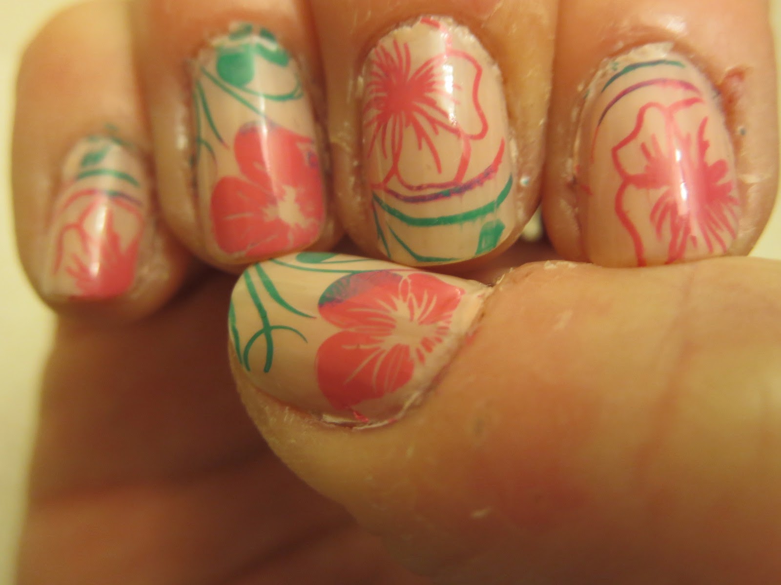
Inspired by Soguesswhat11's latest "fauxtorial," I used a couple of the flowers on Pueen plate #72 to do this design. All the colors are Sally Hansen Insta-Dri: the base is "Petal Pusher," flowers are "Presto Pink," and vines are "Mint Sprint." I like the gold on pink she does in her design, but I have cut all goldtone out of my life at this point, can't backtrack now!

Saturday, February 22, 2014

Vine Buffet

I wanted to do something a little lighter today, so I did a nude base of Nina Ultra Pro in "Spun Sugar," and stamped with Wet n Wild in "White Creme." I used the vine design on Pueen plate #55 from the new Stamping Buffet.


I'm totally digging the larger designs! Once again, no two nails are alike, but they all match.

Monday, February 17, 2014

"Buffet" of Hearts and Stars

When I saw the new Pueen "Stamping Buffet" collection, I fell in love! But then it sold out and wasn't available to purchase for a couple weeks. The minute it was back in stock, I ordered mine!

For my first try with the "all over" style of plates, I went with the hearts, stars, and spirals on plate #63. I love how every finger is different, but they all go together.


I used Sephora by OPI in "Frankly, I Don't Give A-dam," and stamped with Sally Hansen InstaDri in "Vigorous Violet." The InstaDri polishes are usually really good for stamping, but I always forget that this particular color is a little more sheer, so it came out a little lighter than I'd like.

Thursday, February 13, 2014

Valentine's Mani

After weighing all my heart design options, I decided to go with something simple for V-Day. I put down a base of Sally Hansen Insta-Dri "Wined Up," then stamped just a couple fingers with the same polish in "Silver Sweep."

On my ring fingers I used a heart + swirl design from Pueen plate #35. On my thumbs, I used a similar-looking small heart from plate #43. That might have been a bad choice, though. On my left thumb, it's centered and just looks small; on the right, it's off-center which is totally bugging me!

Saturday, February 8, 2014

Blue Waves

I've been wanting to try a gradient manicure for a long time, and finally picked up a pack of foam wedge makeup sponges last week. At this point, my nail polish collection is big enough that I have similar colors that will look good together in a gradient. I actually think this may have been a bit too subtle. I used (lightest to darkest): Pure Ice "Bikini," Maybelline Color Show "Turquoise Paradise," and Sally Hansen Insta-Dri "Blue-ming Fast." I put down a base coat of the medium color first, but in hindsight I probably should have used the lightest color as a base.

Then I stamped on the chevron design from BM-423 using Sally Hansen Insta-Dri "Blazing Blue." As usual, I had a hard time keeping the stamp lined up straight; weirdly, I got the stamp straighter on my right hand than my left! The stamp makes the gradient even more subtle, but the overall effect is kind of like waves on water.


I'll definitely be trying gradients again!

Friday, January 31, 2014

More Bird Stuff

Wasn't going to stamp tonight, but then I decided to add a little something. Of course, I have a hard time lining up images, so it might have been better to just leave them plain.

This is Sephora by OPI in "Frankly, I Don't Give A-dam" (no clue when this came out, I found it on sale at a Big Lot's recently), stamped with Wet n Wild in "Black Creme." The bird is from BM-401, and the feather (which you have seen many times before) is on BM-419.

Friday, January 24, 2014

Pinned it and Did it: Gray Vines

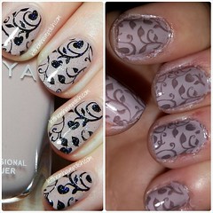
Here's another Pinterest-inspired mani! I found this one actually while browsing Instagram, and loved it! However, I have some events coming up and didn't want to go quite as dramatic as using black on the light background, so I stamped in gray (Sally Hansen Insta-Dri in "Slick Slate") on a base of Nails Inc. "Porchester Square." The stamp design is the same, from Pueen plate #33.