
Showing posts with label wet n wild. Show all posts
Showing posts with label wet n wild. Show all posts
Monday, August 3, 2015
Purple Cherry Blossoms
This was kind of a spur-of-the-moment choice that turned out really well! Base is Sally Hansen Xtreme Wear "Lacey Lilac," stamped with Wet n Wild Megalast in "Disturbia." I used a couple of the little cherry blossom flowers on Pueen plate #59.


Wednesday, July 8, 2015
Fish Scales
Something I've been liking to do lately is paint my nails a solid color for a couple days, and then when it starts showing signs of wear, stamp over it. That's what I did with this mani, which started with just Sinful Colors "Sail La Vie," which got lots of compliments on its own.

Then I used Wet n Wild "Black Creme" to stamp this scale pattern from Pueen plate #86, and finished it off with dots of silver Stripe Rite. I got even more compliments on it this way!


Then I used Wet n Wild "Black Creme" to stamp this scale pattern from Pueen plate #86, and finished it off with dots of silver Stripe Rite. I got even more compliments on it this way!

Sunday, November 30, 2014
Snowflowers
I picked something a little more elaborate than planned for my triumphant return to nail art ;o) Tomorrow is my holiday party at work, so I chose this flower design from my new Pueen plate #75, which reminded me of snow flakes. The base is Sally Hansen Xtreme Wear in "Blue Me Away," and the design is stamped in Wet n Wild "French White." On my ring fingers is Sally Hansen Xtreme Wear in "Breezy Blue," topped with "Sea-ly String" glitter.

How long did it take me to figure out the "Sea-ly String" pun? Way too long.
How long did it take me to figure out the "Sea-ly String" pun? Way too long.
Sunday, June 29, 2014
It's a Girl
I'm throwing my friend a baby shower tomorrow, and it's a girl, so we're doing everything pink. (I hate reinforcing traditional gender roles, especially before the kid's even born, but it's a cute theme.)

This was one of my more involved manis. I started with a base of Wet n Wild "Tickled Pink," and then used a sponge to create a gradient with Sally Hansen Insta-Dri "Love Train" on the tips. I almost left it like that because it looked so nice, but I went ahead with my original plan and used Sally Hansen Insta-Dri in "Slick Slate" to stamp a design from Pueen plate #59. The gray tones down the pink nicely.

This was one of my more involved manis. I started with a base of Wet n Wild "Tickled Pink," and then used a sponge to create a gradient with Sally Hansen Insta-Dri "Love Train" on the tips. I almost left it like that because it looked so nice, but I went ahead with my original plan and used Sally Hansen Insta-Dri in "Slick Slate" to stamp a design from Pueen plate #59. The gray tones down the pink nicely.
Saturday, May 24, 2014
Blue Skies
I was going to just paint my nails with Sally Hansen Insta-Dri "Blue-Away" and leave it at that, but it was like they were calling out for fluffy white clouds! So I grabbed my Wet n Wild "French White Creme" and a dotting tool and went to town.


This was the first time I tried this technique and I love how they turned out!
This was the first time I tried this technique and I love how they turned out!
Friday, April 11, 2014
Bright Butterflies
I was so excited about the spring weather, I wanted to do something with the allover butterfly design on Pueen plate #39. I did a base of Sally Hansen Insta-Dri "Love Train," which has a nice purple undertone. Then I stamped with Sally Hansen Instra-Dri in "Brisk Blue," which may have been kind of a crazy choice, but I was in the mood for something bright. Then I went one step further and used a dotting tool to add some details in Wet n Wild "Frosted Fuchsia," which was probably the craziest idea yet, but oh well...

Saturday, February 22, 2014
Vine Buffet
I wanted to do something a little lighter today, so I did a nude base of Nina Ultra Pro in "Spun Sugar," and stamped with Wet n Wild in "White Creme." I used the vine design on Pueen plate #55 from the new Stamping Buffet.

I'm totally digging the larger designs! Once again, no two nails are alike, but they all match.
I'm totally digging the larger designs! Once again, no two nails are alike, but they all match.
Friday, January 31, 2014
More Bird Stuff
Wasn't going to stamp tonight, but then I decided to add a little something. Of course, I have a hard time lining up images, so it might have been better to just leave them plain.
 This is Sephora by OPI in "Frankly, I Don't Give A-dam" (no clue when this came out, I found it on sale at a Big Lot's recently), stamped with Wet n Wild in "Black Creme." The bird is from BM-401, and the feather (which you have seen many times before) is on BM-419.

Monday, October 14, 2013
Hearts
I wanted to do something with two (or more) different heart designs, and decided on the single heart surrounded with swirls on Pueen plate #35 for my ring fingers, and the hearts with swirly dots from plate #45. On a base of Sally Hansen Insta-Dri in "Wined Up," I stamped Wet n Wild "Black Creme."

Now, here was the problem: as I was doing my first hand, I was getting really frustrated that the design wasn't getting picked up. Then I realized I was using an old bottle of Wet n Wild that I found in the back of my nail polish drawer. I have no idea how long it was in there, but as soon as I went back to my new/current bottle, the designs came out beautifully! So for once, my right hand looks better than my left :o)

Now, here was the problem: as I was doing my first hand, I was getting really frustrated that the design wasn't getting picked up. Then I realized I was using an old bottle of Wet n Wild that I found in the back of my nail polish drawer. I have no idea how long it was in there, but as soon as I went back to my new/current bottle, the designs came out beautifully! So for once, my right hand looks better than my left :o)
Friday, September 27, 2013
Flowers and Branches
I realized I hadn't used this Pure Ice nail polish in "Fairy Godmother" yet, so I did a test to see how opaque it was. Turns out it covers pretty much completely in just one coat! (But I did two anyway, just to be safe.) Then I did this flowery/branchy design from Pueen plate 33 (I just now decided that they were branches) in Pure Ice "Black Out," with dots of Wet n Wild "Rain Check" in the centers of the flowers.

There was a tiny bit of streaking after I put on a top coat, but also my scraper wasn't quite scraping as well as it used to, so there were a couple noticeable streaks transferred right from the plate.

There was a tiny bit of streaking after I put on a top coat, but also my scraper wasn't quite scraping as well as it used to, so there were a couple noticeable streaks transferred right from the plate.
Friday, September 20, 2013
Raindrops
I was inspired by this pin on Pinterest to do a multi-colored, multi-sized polka-dot thing. I went with a base of Wet n Wild "Bijou Blue," and then my plan was to use Sally Hansen Xtreme Wear in "Celeb City" in place of the white in the inspiration photo, and then Pure Ice "Bikini" as the third color.


I think I misjudged the size of the dots, though. Even though I chose different sized dotting tools, the dots meant to overlap ended up being the same size. Just as well, because those two colors are pretty similar right next to each other. So there's no stacking of dots. But that's ok, I like the way this turned out, anyway. The color combo and bit of sparkle looks like drops of rain.


Sunday, September 15, 2013
Lace and Roses
I've been seeing a lot of people on Instagram and such using these rose and lace designs, so even though it's not my usual style, I decided to try this design from Pueen plate #27. In Wet n Wild "Black Creme" on Sally Hansen InstaDri "Vigorous Violet," it comes across as more sassy than sweet :o)

The only bad thing was that the delicate design got pretty streaky when I put on the top coat. Sorry again for my raggedy cuticles - and I had to go with my right hand because it was the less streaky of the two, plus I got a really badass blood blister on my left ring finger :o/

The only bad thing was that the delicate design got pretty streaky when I put on the top coat. Sorry again for my raggedy cuticles - and I had to go with my right hand because it was the less streaky of the two, plus I got a really badass blood blister on my left ring finger :o/
Friday, September 6, 2013
Pink Polka Dots
I really like the color scheme here; gray + pastels seems very current. This is Sephora by OPI "Dance Til Fawn," with dots of Wet n Wild "Tickled Pink." Tickled Pink has proved not to be so good for stamping, and gets streaky as an all-over color, but it's great for dotting. I almost went with more of a fuchsia for the pink, but I'm glad I ended up going with the pastel.


Tuesday, September 3, 2013
Star Light, Star Bright
For this manicure I used Sally Hansen Xtreme Wear in "Marine Scene," stamped with Wet n Wild "Black Creme. On most of my fingers, I stamped the star and dot design from Pueen plate 18, and then added additional dots of Xtreme Wear "Celeb City." On my ring fingers, I used the star pattern on plate 24.
I didn't expect this polka dot design to look so punk rock, but it kind of does. Also, I totally smudged my right thumb :o(
 |
| Ugh, the streaking looks so bad in macro! |
Tuesday, August 20, 2013
Scaley Shells
I wanted to do my nails tonight, so I looked online for some inspiration photos using the Pueen plate sets I have, and kept seeing this image from plate number 13. I had some trouble getting it centered right, but it doesn't look horrendous...


The base is Wet n Wild "Bijou Blue," design is stamped in Wet n Wild "Black Creme," and then I added a dot detail in Wet n Wild "Metallica."
...And pretty much no streaking from the top coat!


The base is Wet n Wild "Bijou Blue," design is stamped in Wet n Wild "Black Creme," and then I added a dot detail in Wet n Wild "Metallica."
...And pretty much no streaking from the top coat!
Thursday, August 1, 2013
Funky Flowers
I'd had my eye on this floral pattern on Pueen plate 25 for a while. I was actually planning on doing a different pattern in black on pink, but couldn't get it lined up right, so decided to go with the flowers instead.

I think I would have liked this more in a different color scheme - maybe even a white background with different colors for the flowers. As it is, it strikes me as kind of a 60s psychadelic flower thing. Also, the base color, Wet n Wild "Tickled Pink," turned out pretty streaky.

I think I would have liked this more in a different color scheme - maybe even a white background with different colors for the flowers. As it is, it strikes me as kind of a 60s psychadelic flower thing. Also, the base color, Wet n Wild "Tickled Pink," turned out pretty streaky.
Tuesday, July 30, 2013
Subtle Strings
I'm not too happy with this one... I've liked this design on Pueen plate 45 since I first saw it - it sort of looks like strings of beads. But I chose the wrong color to use for the stamp: Revlon "Black with Envy." It was just too sheer. However, I love the base color, Wet n Wild in "Rain Check."
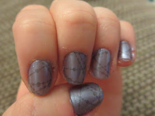
The result is a bit more subtle than I'd like.
So I added a little Wet n Wild "French White Creme" on top, and ... I guess I am happier with the results? Next time I'd like to try something a little more bold and graphic.


The result is a bit more subtle than I'd like.
So I added a little Wet n Wild "French White Creme" on top, and ... I guess I am happier with the results? Next time I'd like to try something a little more bold and graphic.

Friday, July 19, 2013
Blue Jewels?
I had this awesome multicolored stamp all planned, and when I actually went to do it... it just wasn't happening. It's possible these Pueen plates have some kind of residue on them that needs to be cleaned off the first time, but that hadn't occurred to me yet, so I scrapped that idea and went with something else.

 Instead, I painted my nails with Pure Ice in "Kiss Me Here" (gray), and used three of the designs on Pueen plate 26 with Wet 'n Wild "Black Creme." On my middle three fingers, I used the one on the right that looks kind of like chandelier beads in varying lengths. For my pinkies, I used the similar one on the left where they're all the same length, because I didn't want to risk having the mostly blank area end up on my nail. And for my thumbs, I used the swirly dot pattern at the top to cover the large area.
I then went back and added dots of Wet 'n Wild "Bijou Blue" on top of some of the larger gem/teardrop shapes. Unfortunately, when I added a top coat, a lot of the designs smudged :o( I think this was mostly because the top coat is kind of old and gloopy now. That's going into the trash :o/


I then went back and added dots of Wet 'n Wild "Bijou Blue" on top of some of the larger gem/teardrop shapes. Unfortunately, when I added a top coat, a lot of the designs smudged :o( I think this was mostly because the top coat is kind of old and gloopy now. That's going into the trash :o/
Subscribe to:
Posts (Atom)